IRIDESCENCE
HOUSE AND HOUSING
COURSE: ARCH 383 | INSTRUCTOR: PATRICK GESKE | FALL 2019 | WSOA
Through critical analysis and comparison of the historical, contemporary, and multicultural evolution of house and housing, the studio addresses the form and meaning of the dwelling with a discussion that juxtaposes interior vs. exterior space, public vs. private space, community vs. the individual, and traditional vs.
non-traditional families. The studio focus is divided between the single-family dwelling and multiple unit housing typologies. Students explored the trajectory from individual human inhabitation to dense communal living—from inside to outside, from collection to aggregation, from nesting to hatching.
AXONOMETRIC
Iridescence is the phenomenon of certain surfaces that appear to gradually change color as the angle of view or the angle of illumination changes and that is the main concept of this project. As the population in Los Angeles increases,
affordable housing has become a crucial issue that needs fixing. This project does not only offer housing units for the residents of the city of Los Angeles, but also offers commercial and public interaction through the housing building.
ELEVATIONS
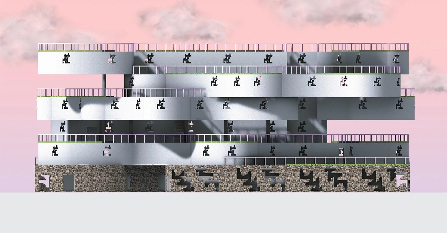
The building is 6 stories high. First floor is commercial space and floors 2 through 6 are residential units. There are a total of 22 units consisting of 2-bedrooms, 1-bedroom and studios. Color plays an important role in this project. Purple represents public/ commercial, Pink represents private/ residential and Green represents green area or open space. The interaction between public and
private is one of the main goals of this project. The first floor offers a variety of commercial spaces such as a gym, a laundromat, a restaurant, two market and retail spaces as well as a gallery space for the residents to showcase their work. The building is also filled with rooftop green spaces that can be accessed by both the residents and the public.
PLANS


